All thunderstorms require low level moisture, instability and a trigger. Severe thunderstorms also require decent wind shear - speed and/or directional change of the winds with height.
The sounding immediately shows the moisture profile. The better thunderstorm setups will have plenty of moisture in the lowest few km of the atmosphere with dry air aloft. But not too much low level moisture - you want to see the temperature and dew point lines with a few degrees of separation like in the first diagram posted above. If there is too much moisture it will be cloudy and/or raining. The temp/DP lines will show very close together or the same values in those cases.
You can also see the complete wind shear profile at a glance. Wind speeds will typically increase the higher up you go. The better thunderstorm setups will have winds backing (anticlockwise) with height in the lower few km. For example N-NE at the surface, N at 925hPa, NW at 850hpa and W by 700hPa is a typical scenario along the east coast. This turning helps establish good updraft/downdraft separation and hopefully a supercell. Of course it is not that simple.
Instability has been touched on by some comments already. We are now going to look at working out instability on analysis soundings retrieved from the BSCH archives. The data for these is actually archived BoM data stored at the University of Wyoming (US). It is presented in much the same way as the BoM diagrams but also include some extra variables. The forecast soundings available from BSCH are drawn in the same way but are based on the GFS
forecast of conditions, not the analysis of actual conditions.
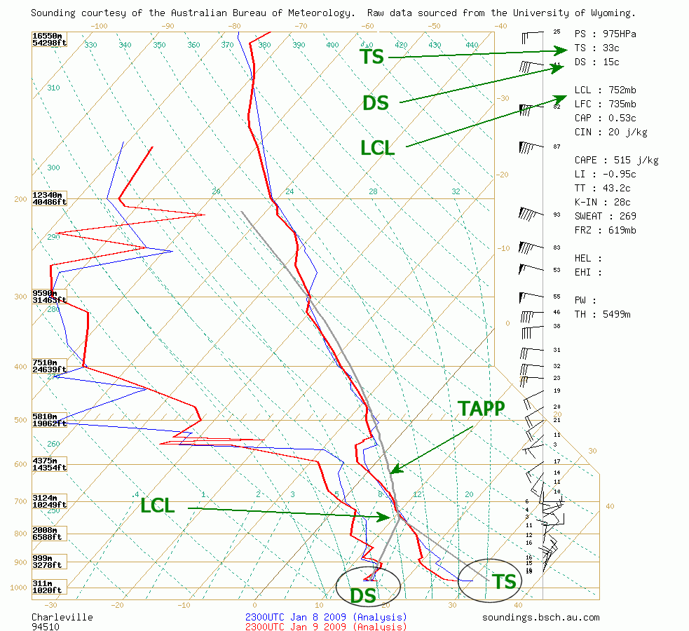
As mentioned by Jason, the Theoretical Air Parcel Plot (TAPP) is a representation of how a parcel of air may rise from near the surface. Where the grey line is to the
right of the temperature trace it is unstable. You will see that the TAPP starts at the bottom of the diagram as an inverted "V". Those two lines meet at the Lifted Condensation Level (LCL) and the single line continues upwards following the alignment of the light green dashed curve (shown on the diagram from the surface to 200hPa). The left grey line is a forecast surface dew point (DS), the value of which is also shown amongst the variables on the top right of the diagram. The right grey line is a forecast surface temperature (TS). These two lines will follow the angles of the other two light green dashed lines.
The LCL will be where cloud bases will initially form - ie. the first cumulus clouds. As more and more convection occurs the air will mix - and cloud bases will develop lower down.
How do we know what the right values for DS and TS should be? There are a few calculations used with the BoM using one that differs from BSCH. With the BSCH website, you can also put in your own values. Eg. Look at observations from towns near the sounding location and enter in the actual temp and dew point.
Numerous thunderstorm indices can be determined from the calculations. The most common are Lifted Index (LI) and Convective Available Potential Energy (CAPE). The high the CAPE and lower the LI the better.
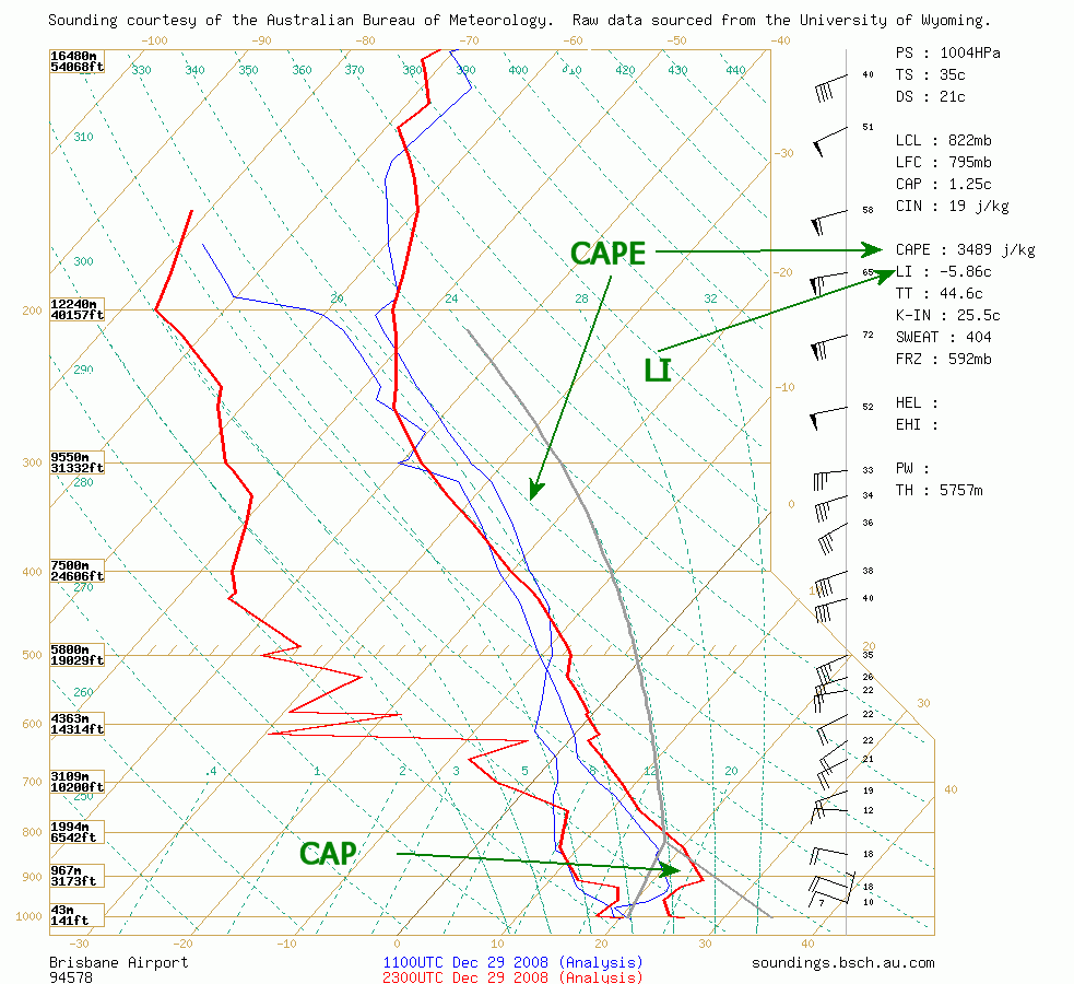
The CAP (or inversion) is a relatively warm layer of air that may delay or completely suppress the formation of thunderstorms. On the sounding it can be seen where the temperature stays the same or often increases with height. You will regularly see this showing above 900hPa. The first sounding posted in this thread has a CAP starting just below 900hPa. The 2nd sounding has none and the one just above this paragraph has quite a strong cap around 900hPa.
Inversions will also occur higher up - the most obvious one is at the tropopause where thunderstorm anvils occur. You may also see inversions in the mid levels. The 2nd sounding shown in this thread has an inversion at 550hPa. These do not necessarily stop thunderstorms but may slow updraft strength.
Lastly (for now), the trigger. This is one part of thunderstorm forecasting that you cannot see on a single sounding. Thunderstorm triggers can be from a surface trough or low pressure system, an upper trough or upper low, cold front, surface convergence, or just surface heating during the course of the afternoon. None of these can be seen on the sounding, however you can use more than one sounding and compare upper level temperatures to help determine if an upper trough may be approaching.